Making a brand stand out․
-
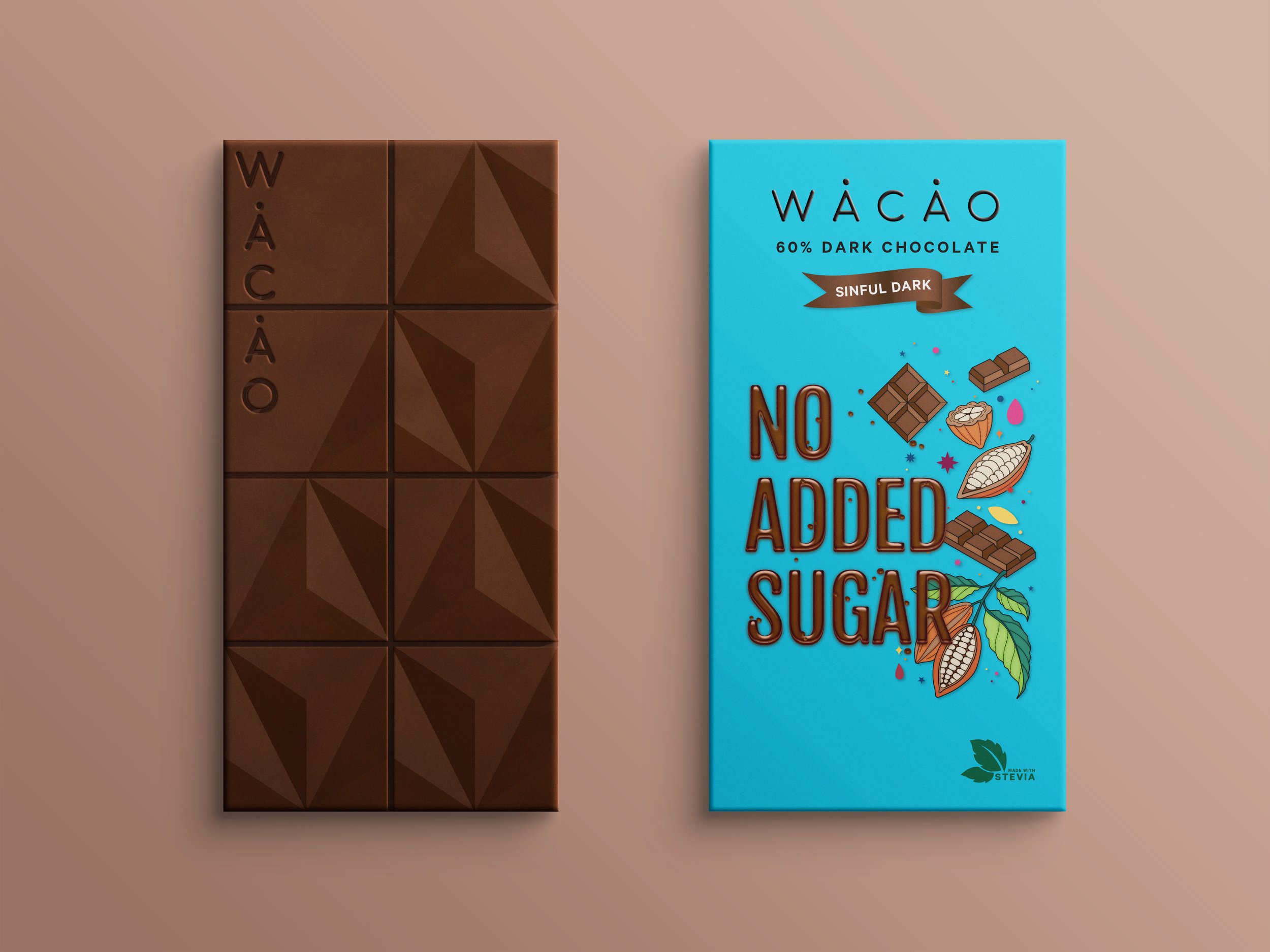
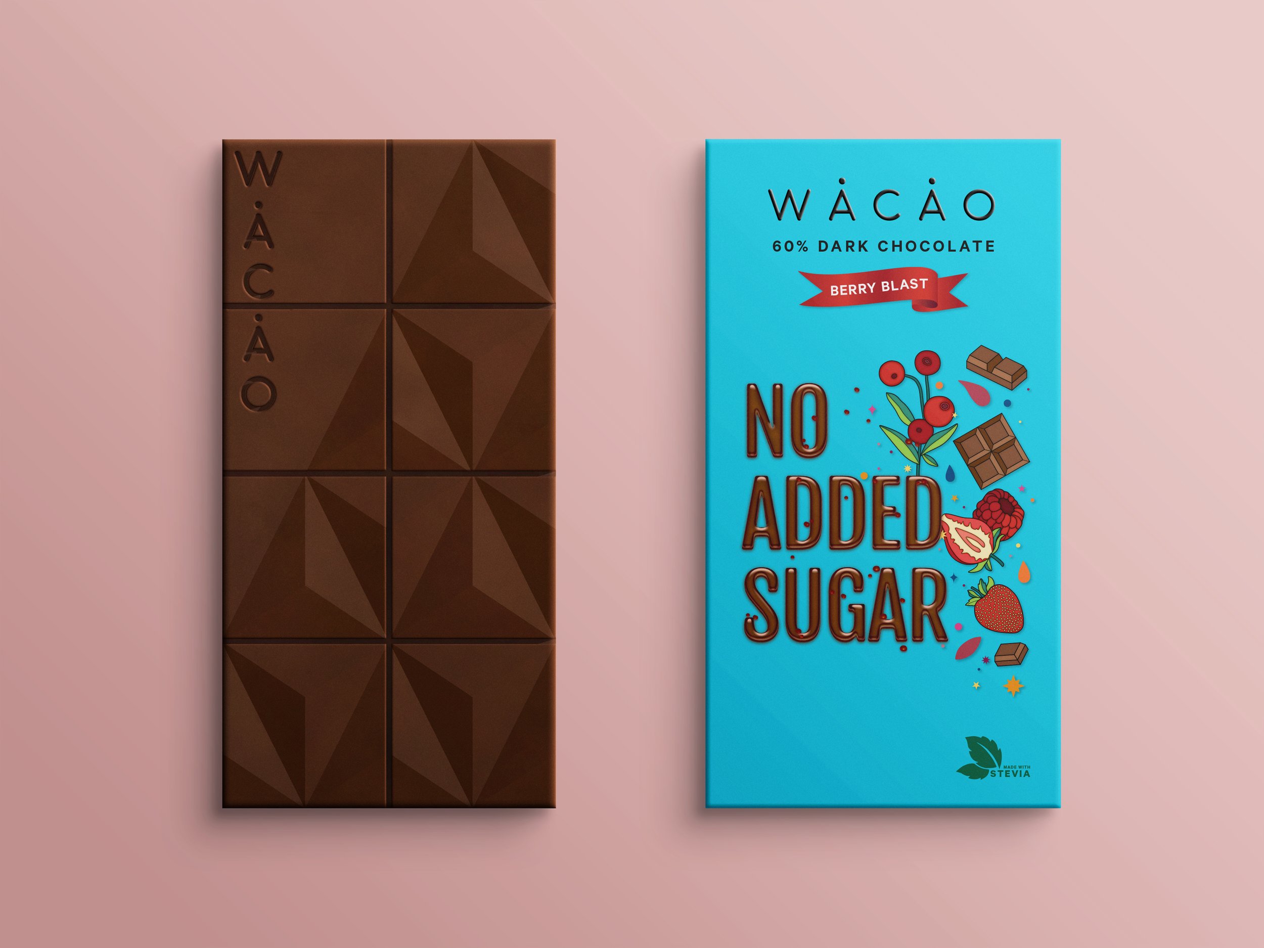
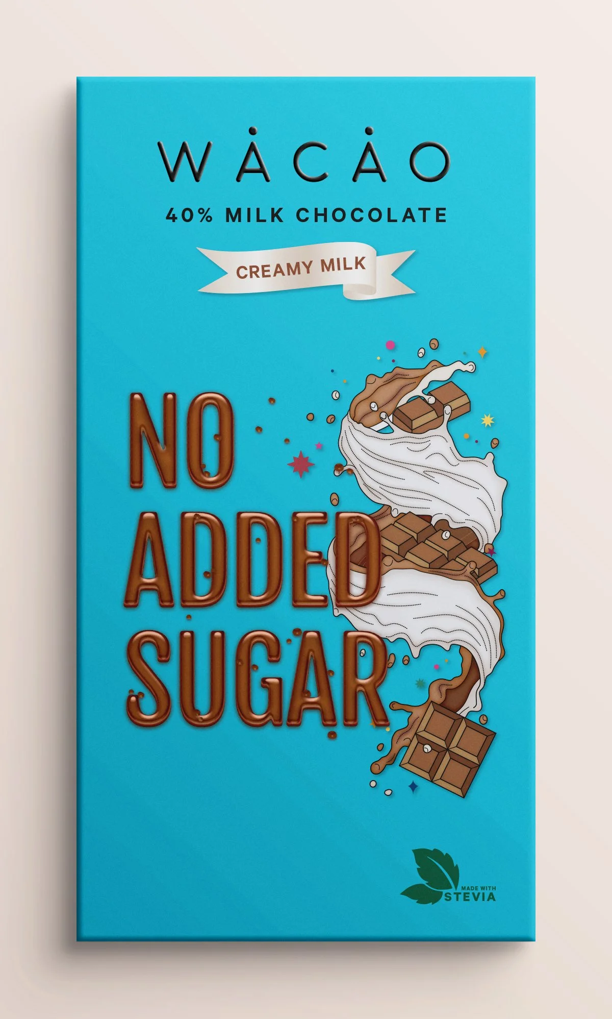
WÅCÅO is a start-up with the aim of introducing sugar-free chocolates to the diabetic capital of the world! A bite of their chocolate reminds you of your favourite chocolate brand - only it's sugar-free! They approached me to help bring their brand to life with an emphasis on creating a holistic sensory experience.
-
Logo design
Outer packaging for 5 flavours (back and front)
Inner sleeve explaining bean-to-bar process
Custom chocolate mould design
Website collaterals -
Yummy + Surprising + Guilt-free + Giftable + Tasty + Local + Artisanal + Minimalistic


Tap on the images below to see the other side.
-
We handpick the best Indian origin cocoa beans to make you loco for our WÅCÅO bar!
-
The beans are fermented in a wooden box covered in banana leaves and dried in the sun to achieve our signature deep flavour and colour - the ultimate space treatment.
-
We then roast the cocoa beans at the optimum temperature to bring out their natural chocolatey flavour.
-
The winnowing process separates the outer husk from the inner cocoa bean.
-
Together with our Super Secret Natural Ingredients, the beans are ground for up to 3 days to give our chocolate bar a melt-in-the mouth feel.
-
Heating and cooling the chocolate, also known as tempering, gives the chocolate its glossy shine and classic snap.
-
Tempered chocolate is then poured into our WÅCÅO mould to set and cool. Once set, each bar is weapped in an oxygen barrier pouch to keep your chocolate well-preserved!
-
Delicious chocolatey goodness made with all-natural ingredients for your guilt-free indulgence!
-
Simple geometric pattern. Dark background with bold shapes. Lines and hatches added to some of the shapes for a subtle allusion to chocolate/ cocoa (leaves, bars, cubes etc). A single colour can be used for all types or different colours for different types. 2 colours used across all bars (light blue and peach). 3 colour variants shown for now - each is used to fill different shapes. A subtle suede texture added to each color to add some interest/ make the composition less flat. Stevia symbol integrated into the pattern.
-
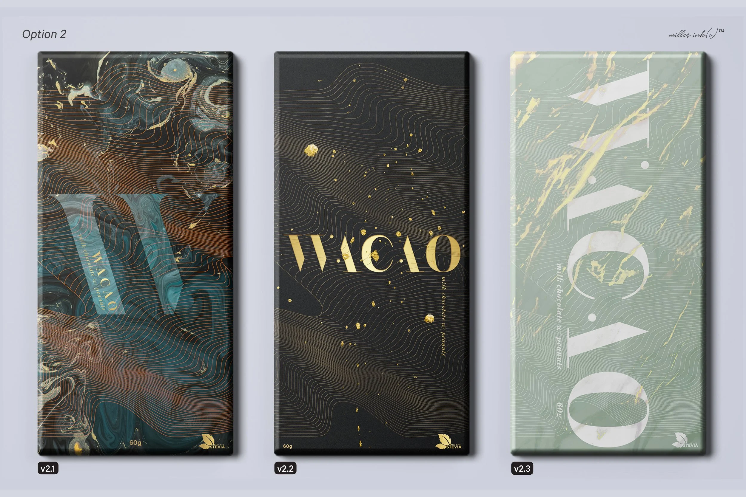
The wave motif is a representation of luscious chocolate - a dreamy association that many people make. This option juxtaposes the wave with various hand painted marble textures in the background. Marble texture and wave pattern can continue across the edge.
-
A fresh/ modern reinterpretation of vintage botanical prints. Textures are collaged in to add interest. Although the composition as a whole is visually complex, the brand name is woven into the botanicals in bright white in order to contrast with the background elements. Subtle shadows added to each item to increase contrast and create the illusion of layers like a collage. Pattern can continue across the edge.
-
An interpretation of the overprint screen-print poster. Although digitally created, when you zoom in, the elements are illustrated to look hand-drawn. Color combinations with this option are limitless but generally contrasting colors work best. Cocoa pods are added in a 3rd color to highlight them. Additional colours are created by multiplying the background graphics with the brand logo colours. Still have to consider best location for additional information (flavours etc.) if you go with this option. Background pattern can continue across the edge.
-
The most abstract of all the options, and the simplest. Playful yet modern composition. Can create different background patterns and color variations for different flavours. All colors have a painted texture for additional interest. Mix of serif and sans serif fonts. Pattern can continue across the edge.


